


Building a user-friendly, responsive report that generates valuable insights is key to driving user interaction and adoption of the report. Nobody likes a bulky, slow report that takes forever to refresh the data and respond to user input.
Taking the time to optimise your report has many benefits, such as:
- Quicker data refresh times
- Faster report responsiveness
- Improved user experience
- Streamlined data model
- Improved decision making
Optimisation is an ongoing process, and I am going to go through some practical methods that you can use to improve the performance of your report.
1) Only Import What You Need Into the Model
When using the Import Mode in your model, make sure you only import relevant data into the model. For instance, if you only need one year's worth of data, do not import the entire dataset into the report.
Let's say you are connecting to an Azure SQL database that has a large number of rows in the table(s). It is advised to create a database view that limits the data to only what you need. This view can be used in your model instead of connecting directly to the table(s).
If you do not have access to the data source, as in the above example, you can write a SQL statement in Power Query to limit the amount of data that will be imported into the model.
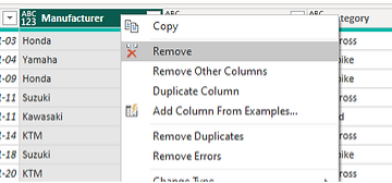
2) Remove Unused Columns
As a Power BI developer, there will be many times when you do not have access to the underlying dataset of a report. For instance, you may be connecting to an API endpoint that you do not have any control over.
As a result, you may be bringing in more columns that are needed into your model. These extra columns will increase the size of your model, and it is best practice to remove unused columns to help streamline your report.
Columns can be removed from the model in Power Query as seen below:
3) Data Model Design Considerations
The architecture of the data model and how the relationships between tables are defined is paramount to the performance of your report. A poorly constructed model will degrade report performance and lead to a poor user experience.
Below are some things to consider when designing the model:
- Combine tables that have a one-to-one relationship.
- Be mindful of how many-to-many relationships will affect your report.
- Use the correct data types.
- Normalise the data if possible.
- Avoid using columns with high cardinality in calculations and measures.
- Using a Star Schema vs Snowflake Schema.

Building an efficient, logical model will improve the performance of your reports and the overall user experience.
4) Use the Performance Analyser
The performance analyser is a great tool to use to understand how your DAX calculations and visuals are performing.
When you run the analyser, you will see three categories under the visual you are analysing:
- DAX query - Time between the visual sending the query and Analysis Services returning the results.
- Visual display - Time required for the visual to draw on the screen, including the time required to retrieve any web images or geocoding.
- Other - Time required by the visual for preparing queries, waiting for other visuals to complete, or performing other background processing.
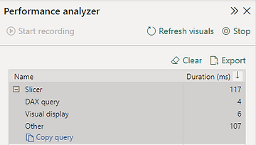
The image above is an extract from one of my reports. In this example, I ran the performance analyser against a slicer to see how it performs.
Interpreting the results:
- A slow DAX query will have a longer duration relative to the overall duration. If so, it advised to investigate the query and how it can be improved.
- If the duration of the Visual display is large, you can reduce the number of data points used or replace it with a different visual.
- The Other category should not be considered as a bottleneck as this time includes the pending operations performed by other visuals.
5) Custom Visuals
Custom visuals can be a great addition to your report as they offer different and additional features that do not come with the standard Power BI visuals. There are many vendors that develop custom visuals that are available in the Microsoft Marketplace to include in your report.
Unfortunately, there may be some drawbacks to including them within your report. This is especially true if the quality of the visual is poor in terms of the code and complexity behind it. These visuals may also include additional libraries and resources, which may impact report performance.
Saying that here are some tips to follow when making use of custom visuals:
- Use them sparingly and only when you need to.
- Avoid using multiple custom visuals in a report.
- Remove any unused custom visuals from the report.
- Only use custom visuals certified by Microsoft.
Optimising a report will take time and effort, but it will pay dividends in the end, as users will be able to gain insights into their data faster and enjoy an overall good experience.
Happy developing!


